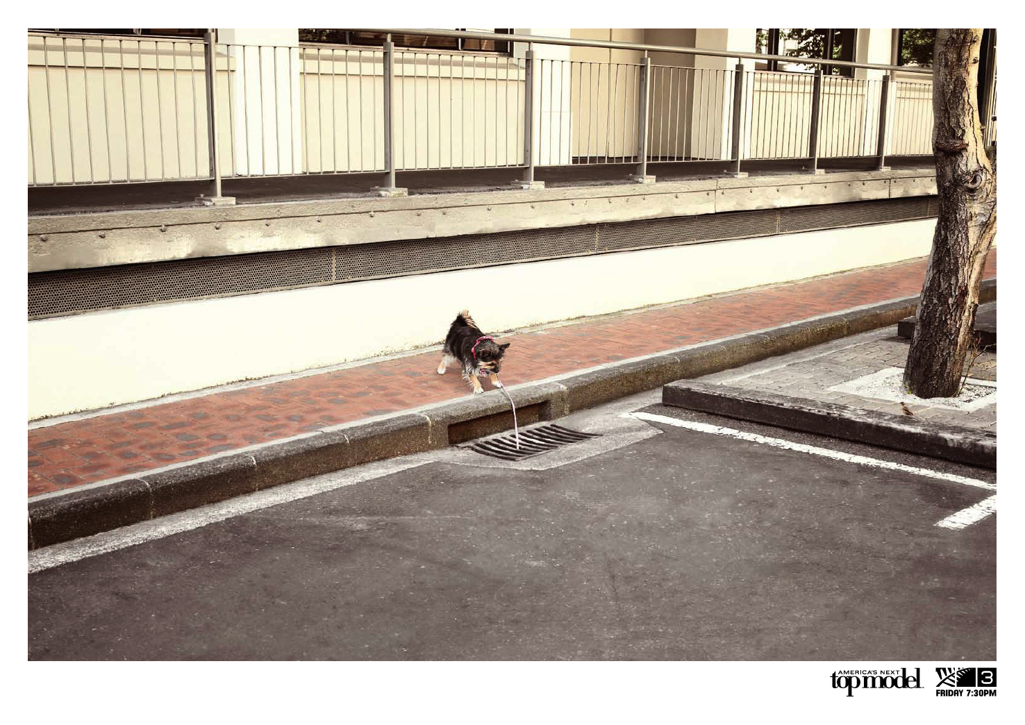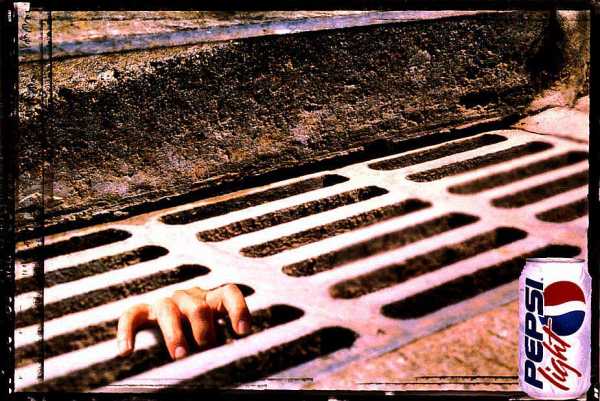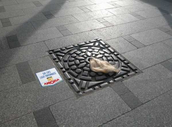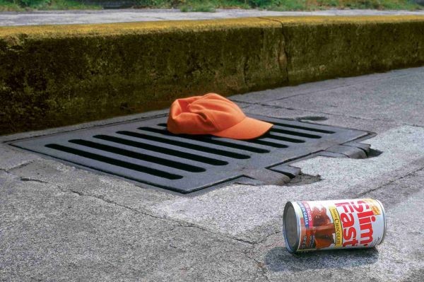


Colenso BBDO had some fun with ideas for promoting "America's Next Top Model" - here they added the silly dog as a nice touch. But yep, you know I'm about the say it so I might as well rip it off like a band-aid. The whole "X is so thin she fall through cracks" visual is tried and true, usually for products like slimfast.
Examples shown here are from BBDO Mexico in 1999 for Pepsi light, Grey Mexico 2004 "cap" for slimfast, and Amora light mayonnaise "Hair" from TBWA France - the last one was an installation rather than a poster visual. I'm pretty sure that there are more examples out there, this is just off the top of my head.
