Over at Deutsch LA the creatives were apparently bored with work for clients, so they got set loose to flex creative and design muscles on a rebrand! And boy did they have fun.
“We are a company that has a history of reinventing itself because it’s just who we are. We are never satisfied. We started as an offshoot with a hunger to prove ourselves—and we’ve never stopped asking ‘Why not us?’ From being the first agency to pre-release a Super Bowl ad to crafting the first-to-market brand partnership with OpenAI, at Deutsch, we think like entrepreneurs and take immense pride in our legacy of ‘firsts’. We don’t know what’s next but we’re ready for it. This rebrand positions us with future big swings in mind,” said Kim Getty, CEO of Deutsch.
As Deutsch moves forward, it’s not just about reflecting on its storied past, but also about what comes next. In tandem with its rebrand, Deutsch will expand its entrepreneurial brand-building program, Blackness in Full Bloom, to include local Hispanic founders. Having already helped over 30 Black-owned businesses since its inception, and recently teaming up with Pharrell Williams’ non-profit, Black Ambition, the program is committed to growing Los Angeles’ entrepreneurial community.
“We’re committed to pioneering in and beyond our industry, building on that same innovative energy and West Coast optimism. We might be dropping the ‘LA’ from our name, but the spirit of the city continues to be a source of inspiration for Deutsch,” said Karen Costello, Creative Chair of Deutsch.

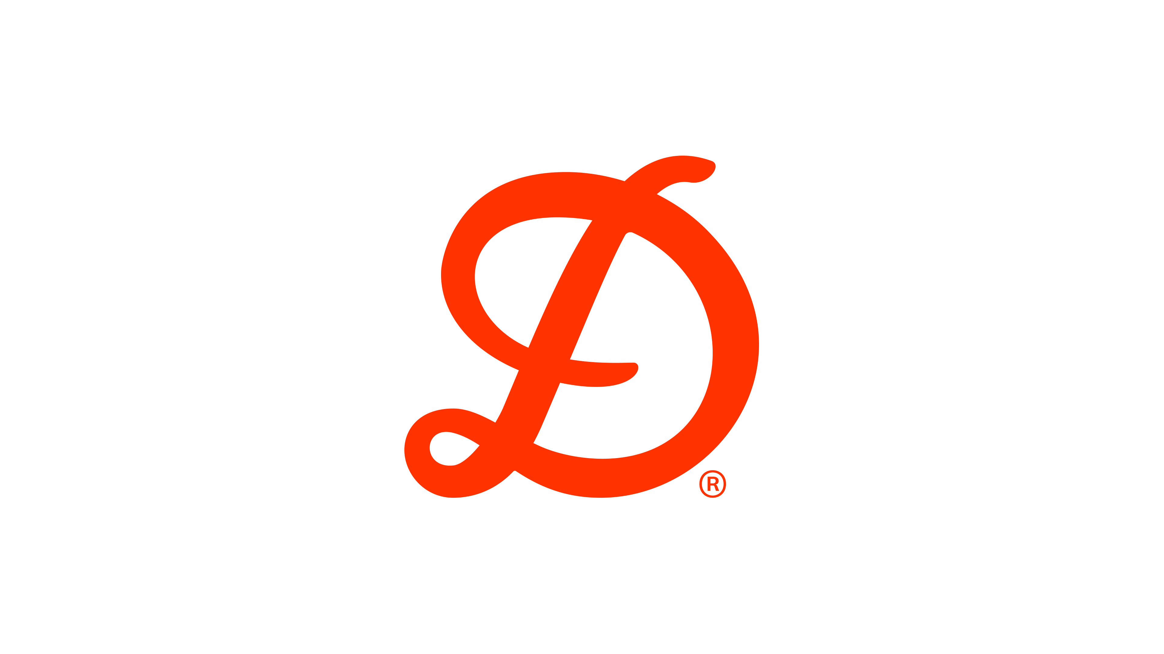
Deutsch’s rebrand highlights the importance of diversity and individuality, both within the agency and throughout Los Angeles. The agency’s new visual brand identity is deeply connected to the cultural tapestry that makes up the city. It blends mixed-media, texture, color, language, code and art. Key brand elements include an “LA” logo that collapses into the new “Deutsch,” and unique AI-generated personal monikers that weave the agency’s logo together with the “D” for each employee.
“Deutsch’s new visual identity nods to our past and connects us to the future with a common thread. The new logo and font boast fluidity from letter to letter, akin to the script and graffiti that fill the streets of Los Angeles. Deutsch’s new vibrant expression reminds us to stay flexible, optimistic, and to champion each other's differences,” said Deutsch’s Chief Design Officer, Adhemas Batista.


Adland® is a commercial-laden heaven and hell for advertising addicts around the world.
This advertising publication was founded in 1996, built on beer and bravery, Adland® now boasts the largest super bowl commercials collection in the world.
Adland® survives on your donations alone. You can help us out by buying us a Ko-Fi. Adland® works best in Brave browser