

This time of year it's not surprising to be bombarded by ads. But it seems that the magazines are heavier than usual this year. Full of stuff to buy and ideas to show your loved ones how much you care. But there's also a lot of different ads this year in terms of how they use the media.
Check it out...read on.
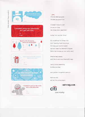
Looks like a few agencies were able to wrangle a nice budget from their clients. Citibank offers some "to: from: " stickers with some quippy sayings for the holidays.
Gap ads are all over the magazines- quite literally. Some magazines have Gap ads in the front, middle and on the back. I guess they want you to be sure to think of them this shopping season.
Here's one that was a bit different:
Front:
Middle spread, each gift lifts up with product shots and some copy about it:
Last page:
And then there's Starbucks. Their Red Cup "viral" didn't seem to bit so much on target but their print ads are more on brand.
But this ad seemed a bit excessive for a coffee company.
First page:
Center spread:
Center spread then opens up to 4 pages:
And the back page:
Maybe we're seeing a new trend in budgets going back up after a couple years of cutbacks and the like. Hopefully 2005 will be more prosperous for everyone.
Many ad agencies
That Starbuk-thingy was really too much... yikes.
- reply
Permalink