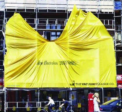
They do - literally, even if they are both award winners and quite good. One won a gold in this years Cannes Festival for Outdoor. Read more to see the pair.

Client: Rowenta
Year: 2000
Found on: Cannes shortlist 2000
Creative Team: Fritz Ehlers, Katja Kloos, Stefan Herrmann
Agency: Publicis Werbeagentur

Client: Electrolux
Year: 2003
Source: Lion Cannes 2004 (Outdoor, Gold)
Creative Team: Peder Schack, Ole Caspersen
Agency: Young & Rubicam Copenhagen
By the way, this isn't the first time we've seen Y&R Copenhagen in Badland, they also did the grates in work for idle hands, last year. Is it becoming a habit?
* note - the "nothing sucks like an electrolux" legendary ad, sadly a misundersood myth, is clarified in the comments


ha-ha-ha-ha-ha-hacks!
I think i've seen this before, somewhere 98 or 97, a poster with a vacuum attached to it "sucked onto it", very similar idea.
- reply
PermalinkOh. It reminded me about some stuff that I saw on Luerzersarchive.com a while ago. Um. Here's some newspaper ads that were made for Electrolux in 2003. "Really really very very strong very strong vacuum cleaner which is very very really strong.".
http://hem.passagen.se/kidkie/ads/elec.html
Client: Electrolux

Agency: Scandinavian Design Group
Art Director: Muggie Ramadani
Photographer: Kenneth Godtfredsen
- reply
PermalinkWow, what a brainsync!
I like those ads you show there, quite good.
- reply
PermalinkThe first poster is great, the ads kidkie shared are clever too, but I'm not so sure that gold-winning Cannes Outdoor advert wouldn't be mistaken for scaffolding-sheets torn in the wind, a very common sight where I am. Not worth a gold anyway, since the idea itself is dead old. Has Cannes jumped the shark?
- reply
PermalinkNice addition kidkie!
What I don't understand is that the poster in 2000 didn't win, but four yeras later the same idea is worth a gold? Publicis Werbeagentur must feel pretty short-changed.
- reply
PermalinkOne thing I like about both ads is that they use the space well. Lots of ads in those kinds of spaces don't. Which is a shame.
- reply
PermalinkI've gotta say that I like all of the creative. The way they used the media is awesome. It's not often you see creative billboards like the first one. I wish there was more of those around in Sweden. Usually they just blow up the press ads and post them. Intergrated campaigns ('disruption' as by TBWA) is often commented as the new thing (!?). What I've noticed is that most of the intregrated campaigns are faked. Just put all the creative in the same design and they pass. Big ideas where the initial idea/strategy runs through the whole campaign is still rare.
Do you guy's have any examples of good integrated campaigns?
Mini by Crispin, Porter & Bogusky!? I don't have any own references to this one. I've only seen it in award books...
- reply
PermalinkIt is a print with similar idea of 1998
 http://www.arik4u.com/arcelik.jpg
- reply
PermalinkNope, it wasn't a myth and no, it did not run in the states and wasn't some badly translated "marketing mistake" as many people claim... Here's the legendary cheeky British "nothing sucks" ad, thanks Alex!

sorry, poor photocopy - the image shows that Electrolux is the reason the leaning tower of Pisa, leans...
- reply
PermalinkLOL! That's great - I'm beginning to think all of these ads suck. You can't tell one brand from the other.
- reply
PermalinkThank you - You've just settled a bet in my office ( I Won!).
I knew that ad had run in the UK and not in the states!
- reply
Permalink... and since both of them are clearly in the 'Outdoor' category... Well.. That is odd.
- reply
PermalinkIn the year end issue of Campaign they listed the Y&R Electrolux ad in sixth place on their list of great international outdoor ads.
I guess they never saw the Rowenta one.
- reply
PermalinkI love the title of your post :-)
Let me offer you one more "russian" example of these sucking ideas.
It's been done in 2005 and send to the Moscow ad fest!
- reply
PermalinkHehe. :) Nothing sucks like an Electrolux is my motto.
- reply
Permalink