If you are font-obsessed enough to get annoyed by all the Gill Sans because it's all wrong in an American ad agency of the 1960's, you'll love that Mark Simonson - bless - has dissected all the font wrongs of Mad Men. Yes, Gotham, ITC kabel, Zapfino and even Gill Sans should not be there.
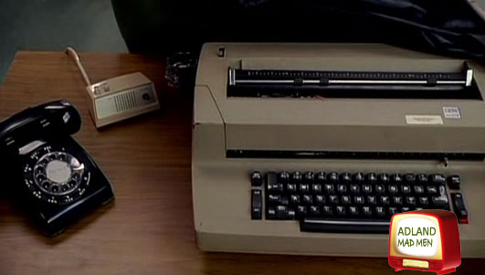
We know that the show isn't historically accurate, heck, they had that IBM Selectric from 1961 already in 1960, but it's nice to know that I'm not the only one obsessing over the tiniest details. Meanwhile, Andrew Hearst covers the thoughtless choice of Arial in the ending credits. At my house, the offspring plays the game of "spot the stuff mommie actually has" and so far she's seen my blue Boylan Seltzer bottle in the show and a few pieces of furniture. "look mom! Yours!"
it also hasn't stopped them from putting the characters on linkedin and twitter. who knew linkedin and twitter were even AROUND during the 1960's?
- reply
PermalinkThe AMC are not behind the twittering fan-fic people. See: Mad Men Tweets not issued by AMC - takedown notices sent and Twitter and AMC get smart - reinstate the Mad Men Tweets. Related: Exxon's brand Hijacked on Twitter by a gal named Janet
- reply
Permalinkall the more reason to argue against user-generated content. ;p
- reply
PermalinkThat Mark guy makes our resident typographer look like a blind novice.
- reply
Permalink