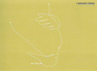
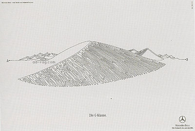
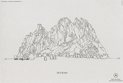
What the butterfly never learned is that the fastest way between point A and point B is in a straight line.
Seems that creatives have learned how to illustrate with that line between point A and point B. Here are two campaigns that rely on the same execution and idea, as the execution is the idea. One campaign is for tyres , the other for luxury cars.
This series for Dunlop Tyres are from Singapore ad agency Doris Soh and Associates. Art Director was Derek Chia, Copywriter was Simon Wong. Though it's hard to see in this tiny size, the line starts with the letter "A" and ends with the letter "B". These ads were found in the Communications Arts advertising annual 43, that is 2002.


Mercedes from Hamburg, Germany and the ad agency Springer & Jacoby. Art Director(s): Szymon Rose and Jonathan Schupp, Copywriter, Stefan Meske. Illustration by Szymon Rose. Campaign spotted in Lürzers Internationl Archive vol 6 2004.


So is this illustration technique the idea, or the execution? Are these two campaigns based on the same idea, what do you think?
Dunlop was first. Mercedes came two years later. The idea and execution seem to be the same, but the concepts behind both are pretty different.
The concept behind the Dunlop campaign can be interpreted two ways: its either centered around getting the things you love, or precious, delicate things from point A to B, or the concept is the tires will last a good amount of time, meaning the time it takes for a baby to grow. (Kind of like the baby in the tire commercials for Michelin.)
The concept behind the Mercedes campaign is centered around terrain and adventure; if there's more to the campaign, I'd expect to see more line drawings of mountains. The G-Klasse, to no surprise, is an SUV. It will get you from point A to B, even if there's a mountain between them.
I think they're both pretty gorgeous executions. Quite different from the expected for both products.
I don't think one did it better than the other.
My question is, did the ADs on the Mercedes campaign happen to come across the Dunlop campaign in CA and think, hey, thats a good idea, and turn around to their creative directors with a tweaked version more in line with their product? Or was it coincedence?
- reply
PermalinkTough call. They are 'selling' two different things, family security and off-road drive.. However the point A->B way of illustrating it is so different and fresh, that in itself is 90% of the idea. The Mercedes team might not have seen the Dunlop ads, despite Dunlop being in the Luerzers ad-bible. Yeah, right.
- reply
Permalink