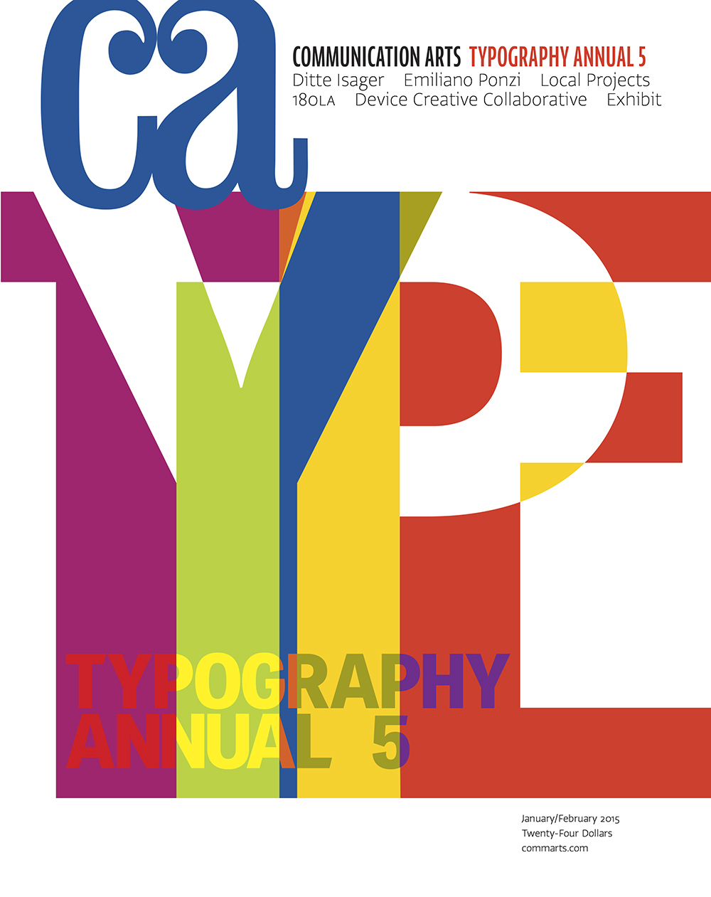
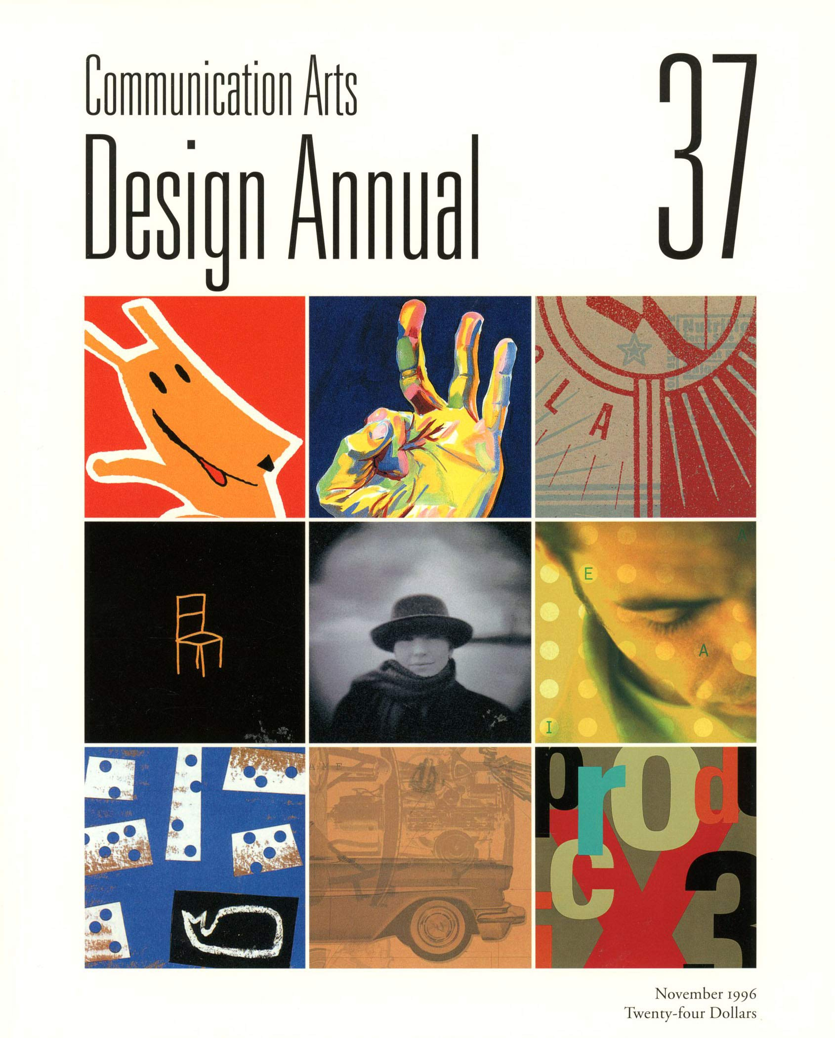
To my shame, I only came across Communication Arts magazine fairly recently, when it became part of the Epica Awards jury. I found it so vibrant, colorful, beautifully written and – naturally – well-designed that I reached for my credit card and subscribed immediately.
What I didn’t realize is that CA has a venerable history. In fact, it’s currently celebrating its 60th birthday. Perhaps because of its California base, the title has the timeless yet contemporary feel of a West Coast jazz band.
As a new fan, I felt it was my duty to chat to Patrick Coyne (above left) – who took over the running of the magazine from his father in 1986 – about the past and present of Communication Arts.


Congratulations on your 60th anniversary. Tell us a little bit about the beginnings of the magazine. I understand it was started by your father? Was he a designer originally?
Patrick Coyne: Dick Coyne held positions as agency art director, copywriter and corporate advertising/art director before opening his own design firm/ad agency in Palo Alto, California, in 1953. Bob Blanchard, who co-founded the magazine, joined as a partner, in 1956.
The firm was quite successful, with a rapidly expanding client base in what eventually became known as Silicon Valley. After launching an in-house typesetting division, Dick and Bob also wanted to build a color separation and litho-stripping facility in order to provide better service and satisfy their interest in improving reproduction techniques, but there simply wasn’t enough work to keep such a facility profitable. After numerous discussions, their best idea was to launch a commercial art magazine to pick up the slack.
When did you decide to get involved in the family business? Or was that evident all along?
I had worked over the summers on the competitions as a kid and as the company janitor in high school but, like my father, I wanted to run my own business. After studying design at the California College of the Arts, I worked for several design firms before opening my own office. In 1986, Dick decided to retire and I had to make the decision whether San Francisco really needed another graphic designer or should I continue my family’s legacy. I chose the latter.
CA is based in California. How has that impacted the style and positioning of the magazine, compared to East Coast titles?
Part of CA’s early success was in showcasing work from all over the country. This was in direct contrast to the existing New York-centric titles and attitude at the time. Even AIGA’s then executive director, Joyce Morrow, told Dick, “why would anyone subscribe to a national design magazine when there’s nothing happening West of the Hudson?”
The style of the magazine is strongly influenced by the editorial direction, which is to try and cover the whole field of visual communications, an impossible, fascinating challenge. Our goal is to provide a transparent framework so the work and people we’re profiling come forward.
How do you put the magazine and the site together – do you have a permanent staff or do you prefer to use external contributors?
We have permanent staff that are responsible for the layout, captions, and much of the daily online content, but we hire freelancers for writing feature articles and columns.
The magazine has had an online presence since 1995. That was pretty forward-looking of you. How do you feel about the print versus digital debate?
Is anybody debating this anymore? Based on our reader studies, there seem to be two distinct audiences when it comes to a preferred method for consuming content. We’ve found we have to offer both print and digital products to remain viable. Then there’s the whole social media morass.
You’re highly active in the awards sector too. How many entries do these attract?
We have six competitions: design, advertising, photography, illustration, interactive and typography. Combined, they attract about 20,000 entries a year. The competitions are an extremely important resource for the magazine, not just for revenue but for discovering new talent and for recalibrating our editorial direction based on the input from our distinguished judges.
Where do the bulk of your readers come from: primarily graphic design, or fairly evenly spread across the sectors you cover? Do you find they’re beginning to overlap?
Graphic designers comprise the largest portion of our readership, about 25%, followed by ad agency creatives, photographers, illustrators, interactive designers and students. There’s a lot of overlap, especially with typography. Everybody loves typography. The blurring of disciplinary lines has been trending for quite some time. Some of it is economic, with budgets that don’t always permit the hiring of photographers and illustrators, but also creative people want to explore other forms of expression. Some of our more interesting profiles have been creatives who’ve moved from one discipline to another.
When I had to move a couple of years ago I had to get rid of my extensive collection of CA annuals and I swear it still hurts my soul.
- reply
PermalinkI remember when you did that.
- reply
Permalink