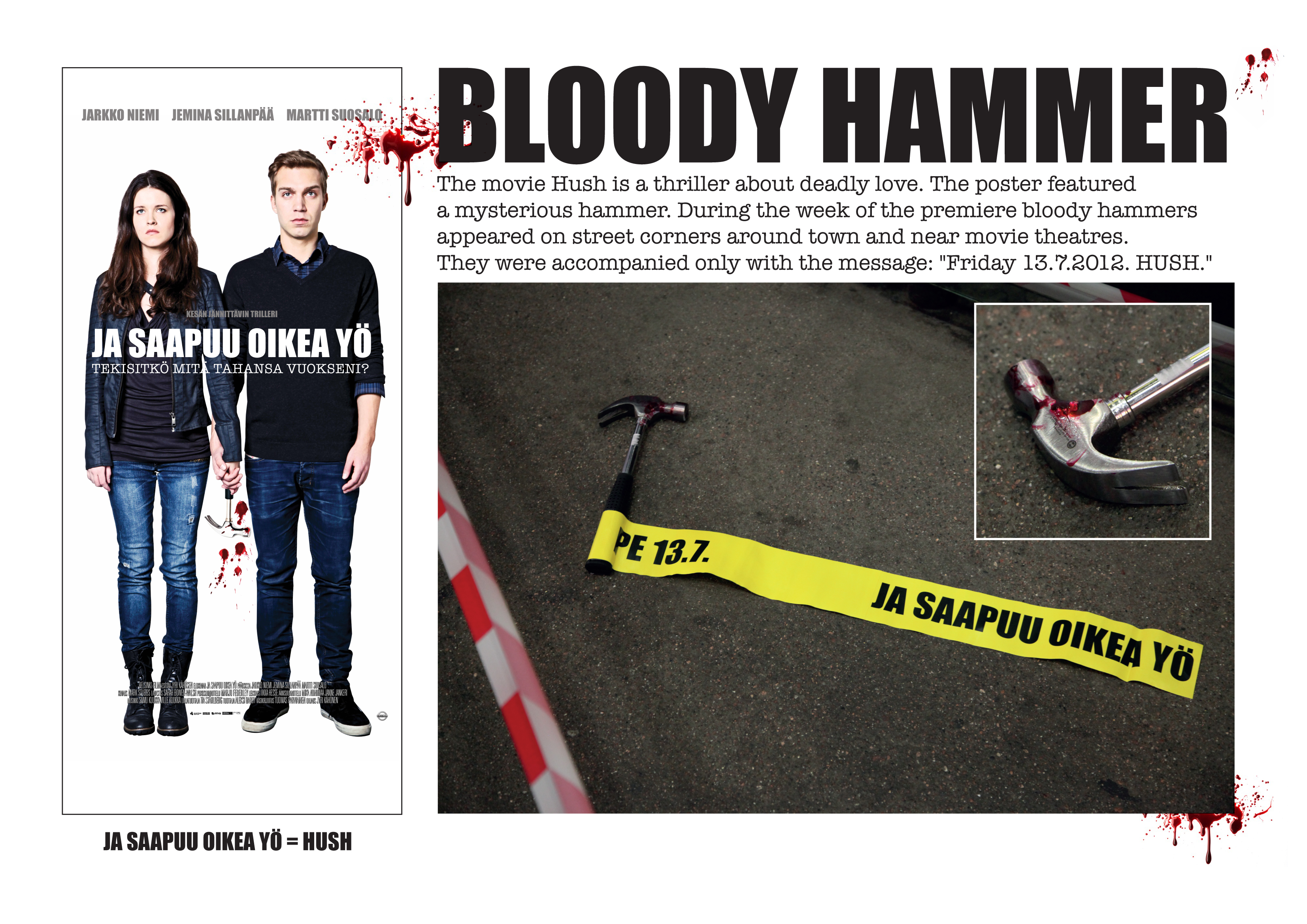
File under delightfully macabre. Finnish Agency 358 Helsinki created this poster for "Hush," along with a teaser: bloody hammers placed around Helsinki movie theaters.
My question is, why bother with the poster? You had me at bloody hammers.
Update: Agency 358 wasn't behind the poster, only the activation elements. It was in fact Scanbox Entertainment who did the poster.
This might even make my point a bit further. The experiential part is more important especially if I'm going to see a movie that week. While posters are great for P.O.S., that's about it. By the way, I always love seeing the 'coming soon,' posters in movie theaters when they're done right. But it's a matter of getting the duration of the hype right.
PROTIP for the Hush people. Please do not make a poster that reads "Hush Part Two: Coming Autumn 2015." Thanks.
Agency: 358 Helsinki
Client: Helsinki Filmi, ScanBox
Creative director: Ale Lauraéus
Copy: Aleksi Bardy
Photographer: Pekka Mustonen
Strategist: Robert From
Agency producer: Elina Freden, Petra Yli-Hemminki
Graphic designer: Isa Jokela-Gomez
Producer, Helsinki Filmi: Jonna Kälviä
