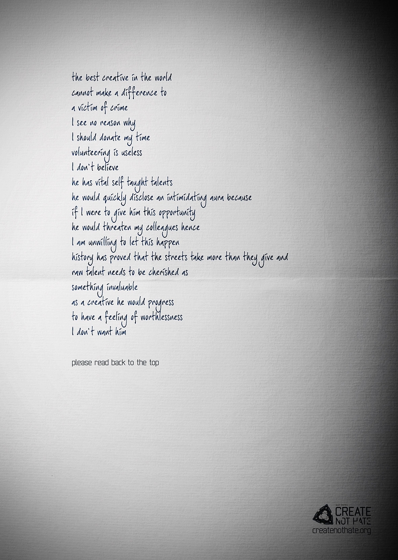
A freindly adland-follower tweeted me that this student award winner is rather good: an idea for "Create Not Hate" by a Miami Ad School team- Lets have a look shall we? The idea here is that you read from top to bottom, and then again from the bottom to the top - and presto the message has changed.
And sure, it's a great idea. Perhaps even award worthy. It has after all been awarded before, that idea. (Oh dear, he she goes again - I keep asking for a support group people, I need one.) [More inside!]
See The Truth (English version) and The Truth / La Verdad (Castellano Versión Original) which brought home a Silver in Cannes Lions 2006. The spot for the Argentine presidential candidate might even have won the coveted gold had it not been for the ensuring discussion of what language it originally aired in (that's what you get for translating your entries too well people. Sheesh, sometimes there's just no pleasing the jury).
This is however not the first version of this idea from TBWA - in 2004 it won Silver in the Cyber Lions category, as it was executed as banner. And before it was a banner, it was a full page print ad.
And before that, it was a popular viral email. Not from TBWA, just as a joke that got sent around in various versions. This idea stems back to usenet times. Remember usenet?
So pardon me for being less than impressed. That said, I really appreciate the writers efforts in making the messages flow both ways. Well done.
i was hoping you would have written your comments in such as way as to reveal an entirely different message when i read it from the end to the beginning.
- reply
PermalinkHa! Yeah that would have been good. Damn.
- reply
Permalinkthey: "didn't know". yeah, please...
and which one you like from shortlist:
http://studentawards.dandad.org/2009/categories/8/press
- reply
PermalinkThe visual here, with headlines made out of guns charmed me - I find that most of them have a very weak call to action somehow. "Create not hate" Yeah alright, I'm with ya but what do I do? Hmm?
- reply
Permalink