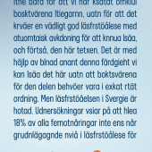
Pressbyrån in Sweden, a place to pick up magazines, newspapers, and snacks ran this ad in a few Swedish tabloids, photo by Jörgen Krusell on Twitter who commented that it was a "good ad," and I have to agree.
The body copy reads perfectly fine, even though all the text is jumbled with letters appearing in the wrong place of almost every word. The headline states that few Swedes can read this ad, "Fewer sdwees can raed this advertsieemnt" , and the body copy begins with: "Not only because we have rearranged the letters a little, but because it requires very good reading comprehension to be able to read, and understand this text." The body copy is consistently misspelled in the same manner all the way through, but surprisingly simple to still read.

"But reading comprehension in Sweden is threatened. Surveys show that as many as 18% of fifteen-year-olds do not even reach the basic level of reading comprehension for further learning in school. And as reading comprehension declines, so does young people's natural desire to read.
Therefore, the press agency started the initiative "The road to reading." For us, it is not what you read that is important but that you read."
The best part of the ad is the link for Pressbyrån's website, which is also misspelled. But perssbryan.se will take you to their website! Nice detail.
They also ran the copy from the ad on their Instagram channel.


That was weirdly easy to read.
- reply
Permalink