

Kelseys has been one of Canada's go to restaurants since 1978. In an increasingly competitive market segment they were looking to attract the new generation of Kelseys customers while not alienating their strong base of regulars. Kelseys came to Open for help in looking to define today’s Original Roadhouse while being relevant and modern.
Open worked with the Kelseys team to develop a new identity that was true to its roots – capturing the original roadhouse concept, the classic red and blue of the original brand, and just the right amount of nostalgia.
![]()
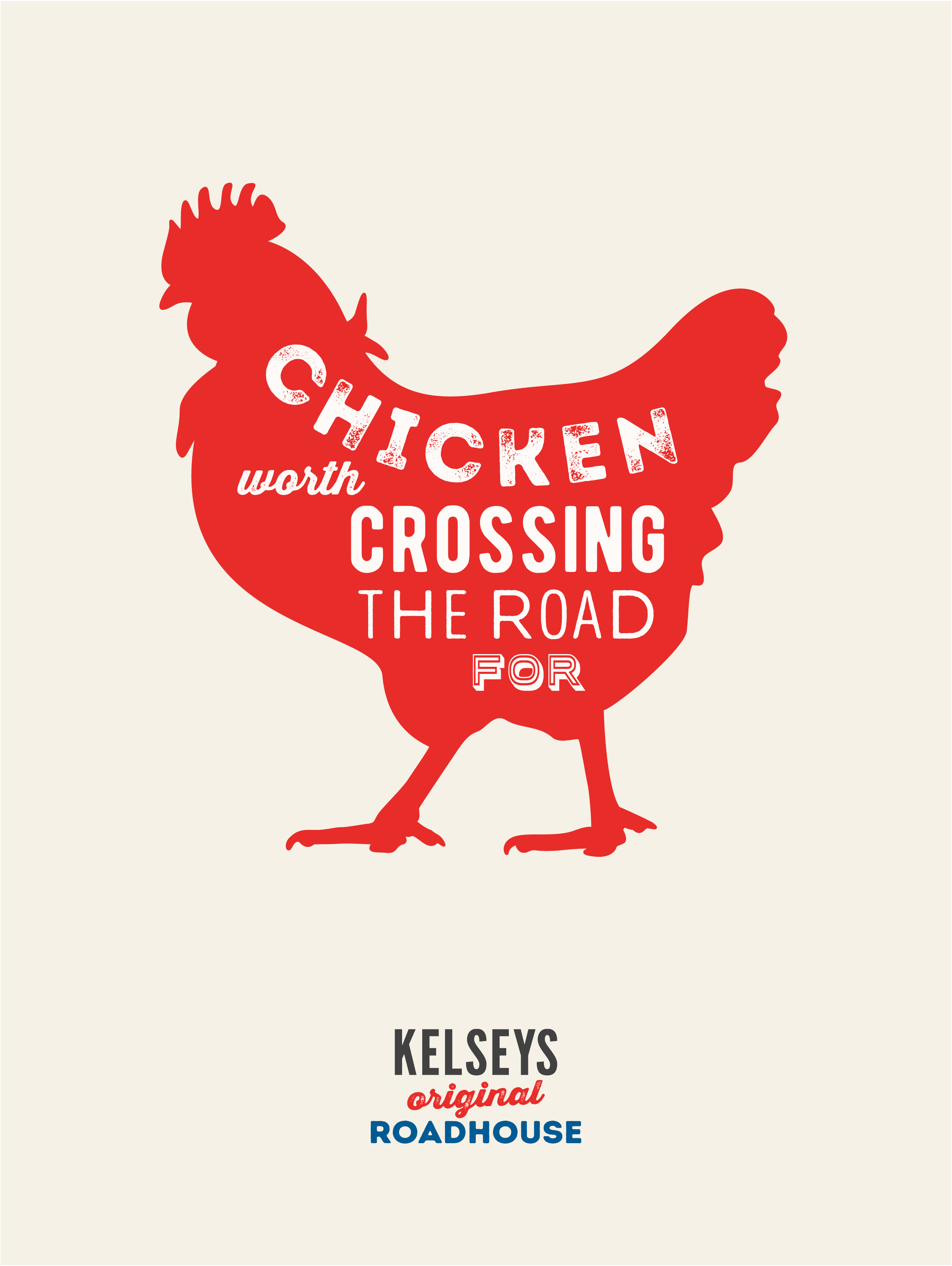
Every customer touch point was considered - from the menu, uniforms of the 'Krew', how the burger and fries were served, to a postcard takeaway that you could send from the road. Open also handcrafted a set of unique icons for each of the core menu's main offerings - burgers, roadhouse favourites, chicken, salads, and appetizers. The typefaces used in signage and throughout the menu had just the right amount of grit for a true roadhouse and modern hues of the red and blue from the original identity were chosen.
Starting at their Burloak location in West Oakville, ten locations have been renovated to date, with plans to renovate the rest of the system by 2019. Open and Kelseys have created a new experience that is worth a road trip.
Creative Agency: Open
Partner, Creative: Martin Beauvais
Partner, Strategy: Christian Mathieu
Art Directors: Jessica Rogers, Alyssa Campeau
Copywriters: Samara Luck, Katrina Menary
Account Director: Anne Ngo
Client: KELSEYS (CARA)
Director of Marketing: Anesie Johnson-Smith
Senior Vice-President, Casual Dining Division: Grant Cobb
Assistant Brand Manager: Anne Marie Selvaggio
Marketing Coordinator: Ann Donnelly
I really really love these, the color scheme is perfection, both modern and retro at the same time. The animal pattern reminds me of 1960s french fast food restaurant patterns (you would have to be a huge 60s film nerd or have visited France when these were still around to know what I mean)
I'm not usually a fan of mixing all sorts of typefaces but this playful look works really well in the posters and this logo in particular. Nice work overall.
- reply
Permalink