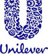
As Grant just said on adlist, "the logo committee couldn't be happier." - perhaps that is how this happened to Unilevers new Logo. Their press release tells us what each symbol inside this logo should mean to you: (read more..)
"Everything starts with the sun - the ultimate symbol for vitality.
The heart represents love, care and health - it's about feeling good.
The shirt represents clean laundry - to look good.
The bird represents freedom. Freedom from mundane daily tasks, to get more out of life."

We'd like to hear what the logo really means to you - what do you see in this? Golfclubs? DNA strands? Fish? Disembodied hands? What does that mean to you?
I see a (silver?) spoon in there - symbolizing the designers fat paycheck. I also see an exploding death star in the upper right (left hand side) part of the U - symbolizing the design committees love for Lucas.....
- reply
PermalinkI bet those were some scary design meetings to sit in on...
"Let's use a sun."
"No, wait, what about a shirt."
"Well, how a bout a hand?"
"No, no...let's use a whale."
"Hey, let's put them all together in the logo!"
*cheers heard throughout the conference room, except for the designer silently weeps*
I'm no designer but aren't logos supposed to be simple??
- reply
Permalinkaye - that was the general idea back in the 'good old days' when technical (printing et al) limitations would muck things up and simple was key. 15 logo design trends spotted by LogoLounge showed multi-colored delicate and crazy new trends - even 3D-looking photo-logos.
I could actually see this being done with older techniques if the edges of the little symbols weren't so perfectly rounded and the spaces between them was a little bigger.
But I still don't know what the fish is doing in there. I like simple ideas, and throwing an alphabet-soup of symbols at me is anything but.
- reply
PermalinkI see a snowflake - symbolizing the cold reception this pukefest of a logo is getting....
- reply
PermalinkIf you squint your eyes it looks like a man's package. A hairy man's package.
- reply
PermalinkAll I see is Delft.
- reply
Permalinkeeep! I'll never be able to look at that logo with a straight face again.
- reply
PermalinkI see a broken ninja star and Jordie's (please ignore the spelling) visor thing from Star Trek: NG, as well as something that could be a bra or dna.
....hmm.
- reply
Permalinkha! Now that you mention it.. I think I see some wooden clogs in there.....,
- reply
PermalinkAlthough... I think it's better than the old one... :)
- reply
PermalinkThere is a palmtree in there, symbolizing the old board-joke "Open on a sunny beach".. And that DNA/Bra thing is just strange, do Unilever have patens on DNA strands?
The hippy-tripppy logo is growing on me, I actually like it. I'm not so sure about the script font though, it feels a little 80s to me and there are plenty of good scripts out there.
- reply
Permalink'bout the DNA - a wild guess: isn't Unilever a player in the med-biz too? And the med-biz is all about DNA, genes and biometrics nowadays...
- reply
Permalinkthis was back in May 17 - but I didn't spot it until now. Unilever: 25 Times Friendlier
- reply
Permalink