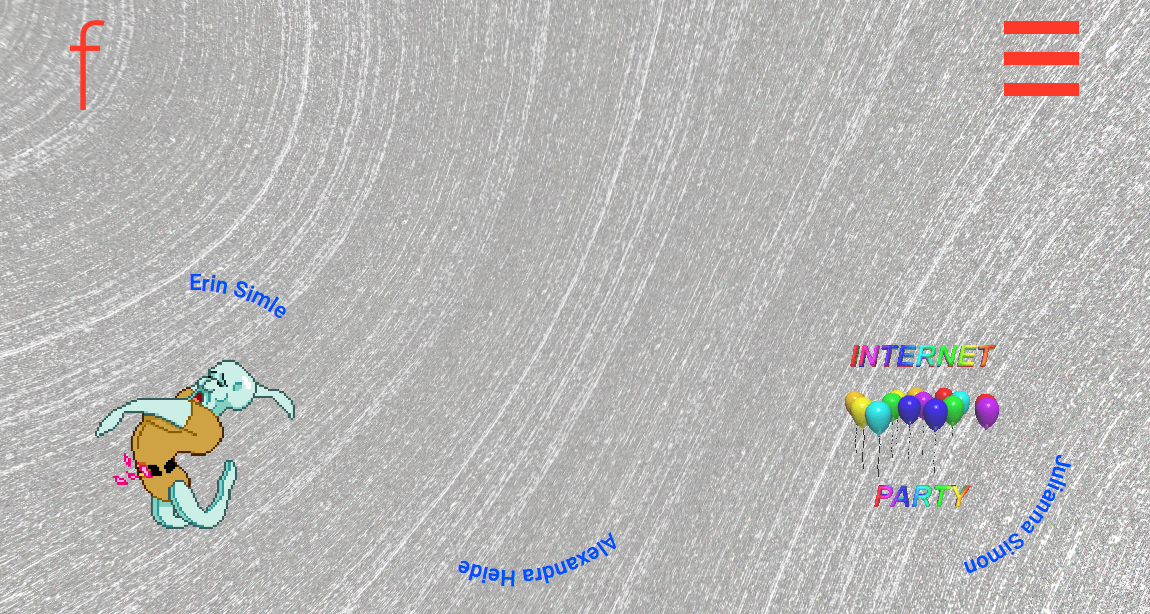

What on earth happened to Fallon's website? It has gotten the retro-but-in-a-ironic way refresh, where blinking gif balloons show you the way to the group planning director, and the work slides on a weird grey background that makes me dizzier than oculus rift. The Brandi jokes Everyone is calling their friends over at Fallon like, “What had happened? Who did this to you? Why they do that?”, but I suspect the explanation is far simpler - the revamp is a desperate cry for help to attract more loctite type clients, and maybe a few more Quicken Loans clients. Maybe it's even there to distract a little from the the negative response that Quicken loan ad got yesterday, as a large group of viewers flashbacked to the crash of 2008 upon seeing it. If anyone goes to Fallon's site to try and find who is responsible they may find they have a seizure instead. An avalanche of dank memes will pummel them into submission. Only those truly hep enough to get it can navigate this site, son.src="adland.tv/octite-win-glue-2014-30-usa">loctite type clients, and maybe a few more Quicken Loans clients. Maybe it's even there to distract a little from the the negative response that Quicken loan ad got yesterday, as a large group of viewers flashbacked to the crash of 2008 upon seeing it. If anyone goes to Fallon's site to try and find who is responsible they may find they have a seizure instead. An avalanche of dank memes will pummel them into submission. Only those truly hep enough to get it can navigate this site, son.
This site crashed my Chromebook. 3/10, would not visit again.
- reply
Permalink