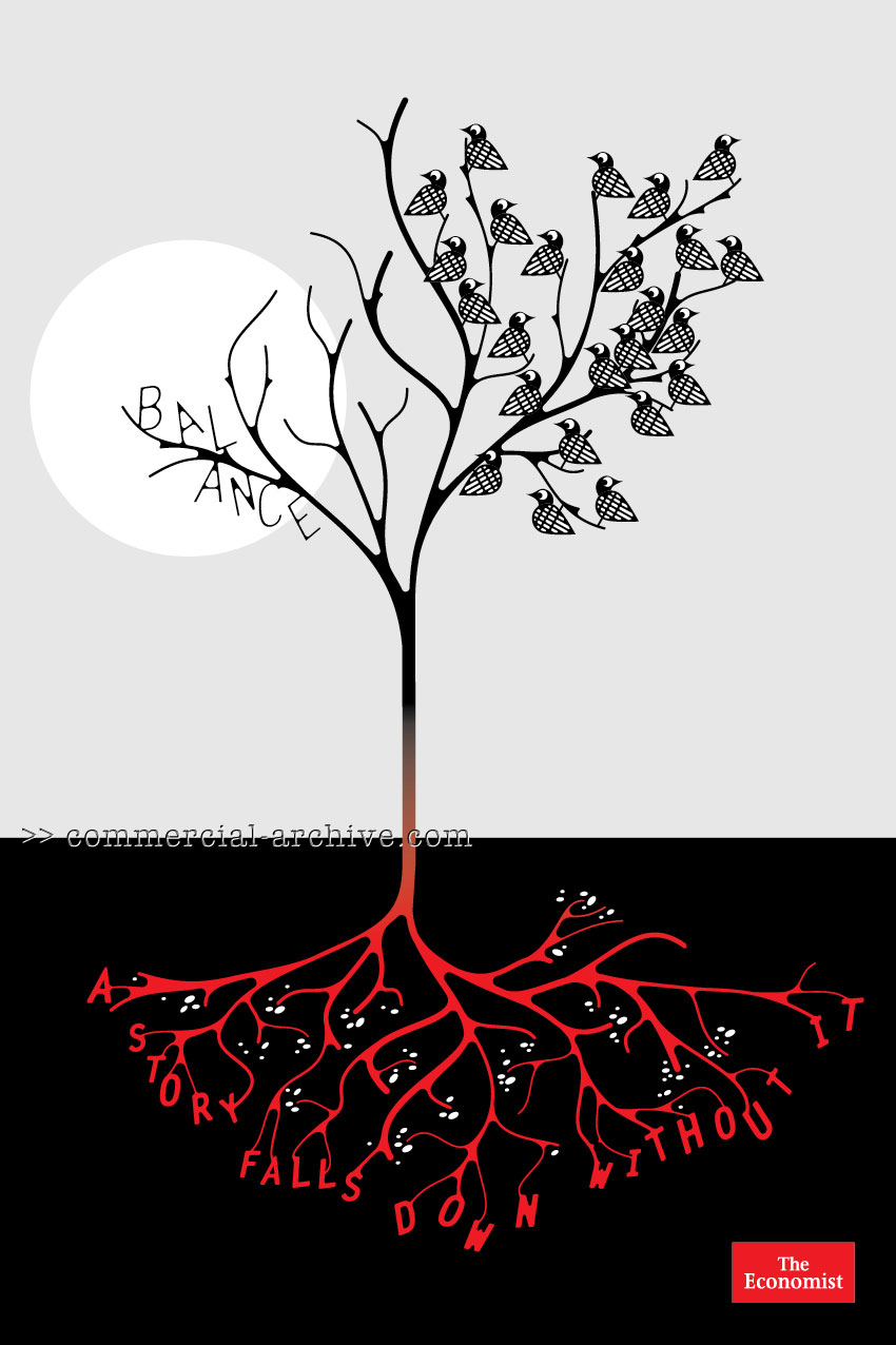


AMV BBDO London has launched a new branding campaign for the economist, and with it they bring back the visual. And not just any visual,s they've gotten a hold of Paul Davis, Anthony Burrill and Design team Non Format (who did the "Balance" ad you see here) to lend a hand.
I love it, especially the "Balance" poster, my fave.
Mark Fairbanks and Tim Riley were the writers on this project, together with Paul Cohen Art Director and Paul Brazier is the Executive Creative Director.
Call me old-fashioned, but I like my Economist ads to be about great words on red. These are too lightweight. I like them though, but not for The Economist. Plus, I'm sure I can badland that 'balance' ad. It might take me all week to put my finger on it though.
- reply
PermalinkYou're old fashioned!
Sheesh, someone had to :)
- reply
PermalinkWhen I first saw this comment in the Recent Comments list, I thought that it said "You're old" (and nothing more).
I was wondering who found out! ;-->
- reply
PermalinkI don't think these are as recognisable as the red background and witty copy line, but The Economist was in need of a refresh.
The new art direction is sublime even if the ideas are a long way from what we've come to expect (in comparison, that is; standalone they work - well, they work for me)
But oh, the irony if these are badlanded! :)
- reply
PermalinkI'm working on it! I'm thinking it's on an album cover, rather than another ad.
- reply
Permalink